

Think sector heatmaps are just pretty charts?
They’re not.
These color grids show who’s leading and who’s lagging in real time.
Read them right and you can spot rotation, momentum, and risk before the headlines do.
This piece breaks down the simple cues—color, tile size, timeframes—and ties them to macro drivers like rates, oil, and earnings.
By the end you’ll know what a bright green Tech tile really means, when a single outlier is noise, and how to use heatmaps to make smarter investment decisions.
Understanding Sector Performance Heatmaps
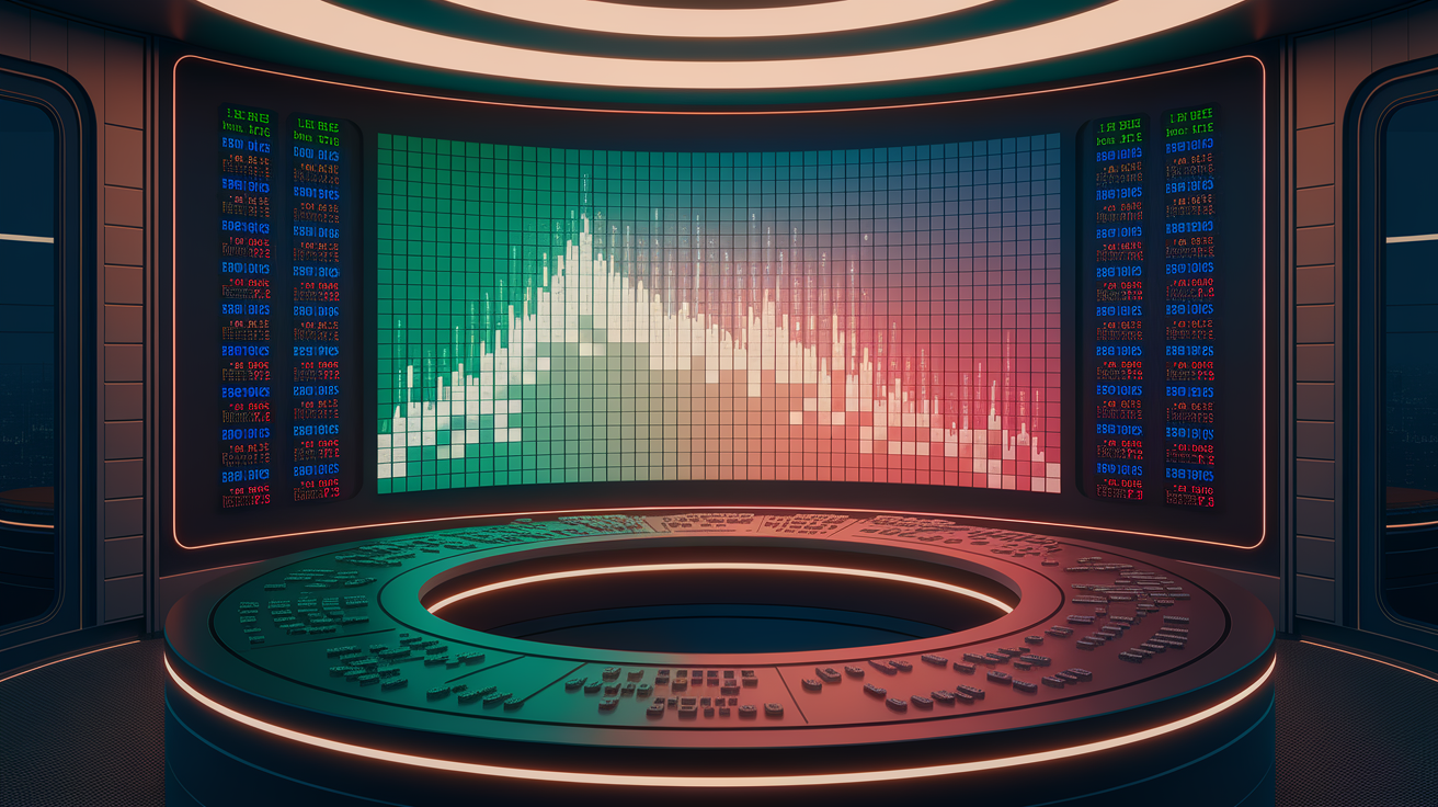
Sector performance heatmaps turn messy market data into something you can actually read. They’re just color-coded grids showing how different parts of the market are doing right now. Each tile is a sector (Technology, Healthcare, Energy, whatever) and the color tells you if it’s up or down. Green means gains. Red means losses. The brighter the color, the bigger the move. Dark green? Strong gains. Dark red? Getting crushed. Pale colors mean not much is happening.
Most heatmaps use GICS (Global Industry Classification Standard), which splits stocks into 11 main sectors. You can drill down into industries and sub-industries, but the main view keeps it simple. Tile size usually maps to market cap or index weight. Tech might take up a huge chunk because it’s 30 percent of the S&P 500, while Utilities gets a tiny square at 2 percent. Bigger tiles matter more. A giant green Tech tile moves the needle way more than a small green Materials square.
Why bother with heatmaps? They show you what’s driving the market today. If Energy’s blazing green while everything else bleeds red, you know there’s a specific theme at work (maybe oil spiked, maybe geopolitical tension). If all the colors look washed out and mixed, the market’s probably stuck in a range with no clear direction. Reading these patterns fast helps you figure out where to hunt for trades, where to cut risk, and whether the market’s rotating or just drifting.
What you’ll see on most heatmaps:
- Color coding: Green = up, red = down, brightness = how much
- Tile size: Bigger tiles = more index weight, more influence on the overall market
- Percent labels: Actual numbers like +2.5% or -1.3% printed on each tile
- Sector groups: Usually 11 sectors for U.S. stocks, organized by GICS
- Timeframe toggle: Switch between 1 day, 5 days, 1 month, 3 months, 12 months
- Benchmark compare: Some show sector performance vs. an index like the S&P 500
Key Metrics and Visual Cues in Heatmap Interpretation

Colors and sizes aren’t random. They’re backed by actual performance numbers. The most basic metric is percent return over whatever period you’ve selected. Viewing a 5-day heatmap and Tech shows +2.3 percent? That’s why the tile’s green. Color scales are usually linear. Gains from 0 to +0.5 percent might be light green, +0.5 to +2 percent medium green, above +2 percent dark green. Same structure for losses, with thresholds around -0.5 percent and -2 percent. These can shift depending on how wild the market’s been lately. In a calm stretch, +1 percent stands out. In a volatile mess, you might need ±3 percent to really pop.
Tile size reflects market cap or index weighting. A sector labeled “Technology (30%)” means Tech is 30 percent of the index’s total value. When that tile goes bright green, it’s pulling the index up hard. When it’s red, it’s dragging everything down. Some heatmaps layer in volume data, either as a hover-over detail or a secondary color overlay. High volume on a green tile confirms real buying. High volume on red confirms real selling. Low volume on a bright move? That’s thin and probably reverses soon.
Relative strength is another embedded metric you’ll see. Instead of absolute returns, some heatmaps show sector performance minus the benchmark’s return. If Energy gained +2.5 percent over five days and the S&P 500 gained +0.4 percent, Energy’s relative performance is +2.1 percentage points. Positive relative value means the sector beat the market. Negative means it lagged. This matters for tactical plays because it isolates sector-specific moves from the broad market drift.
Metrics hiding in the tiles:
- Percent return: Price change over your selected period, shown as a percentage
- Market cap weighting: Tile size = sector’s share of total index value
- Volume delta: Change in trading volume vs. average, sometimes in tooltips or color overlays
- Relative performance: Sector return minus benchmark return, measured in percentage points
- Volatility flags: Some heatmaps shade by standard deviation or beta to show risk alongside return
Identifying Patterns and Trends Across Sectors

The real trick with heatmaps is spotting patterns that tell you what phase the market’s in. Sector rotation is one of the most common. When Energy, Materials, and Industrials turn green while Utilities, Consumer Staples, and Real Estate go red, that’s textbook rotation into cyclicals. Cyclicals lead when people expect growth or rising commodity prices. Flip it around. If defensive sectors (Healthcare, Staples, Utilities) are green and cyclicals are bleeding, the market’s rotating into safety. Usually happens when growth slows or uncertainty spikes. Watching this play out on a heatmap gives you an early read on sentiment shifts before the data catches up.
Momentum clusters matter too. When multiple related sectors flash the same bright color (say, all cyclicals are dark green), that’s broad momentum around a specific theme. One bright green tile surrounded by red or neutral? That’s an outlier. Could be a sector-specific catalyst (earnings beat, regulatory news) or a short-term overreaction that fades fast. Dispersion, the spread of colors across the heatmap, also tells you something. High dispersion (some tiles dark green, others dark red) means active rotation and stock-picking opportunity. Low dispersion (everything faint or neutral) means range-bound market with no clear winners.
You can catch divergence by comparing short-term and long-term views. If a sector’s bright green over one day but red over three months, it’s bouncing inside a downtrend. Probably mean reversion, not a new trend. If a sector’s consistently green across 5-day, 1-month, and 3-month views, that’s persistent strength. Way stronger signal. Always check multiple timeframes to filter noise from trend.
Patterns worth watching:
- Cyclical rotation: Energy, Materials, Industrials green, Defensives red = growth expectations rising
- Defensive bid: Utilities, Staples, Healthcare green, Cyclicals red = risk off or slowing growth
- Momentum clusters: Multiple related sectors showing the same bright color = broad thematic strength
- Outlier moves: Single sector extreme while others neutral = check for sector-specific news or short-term pop
- Dispersion spikes: Wide color spread (dark greens and reds) = active rotation, stock-picking window. Narrow spread (faint colors) = range-bound chop
Timeframe Interpretation and Multi‑Period Comparison
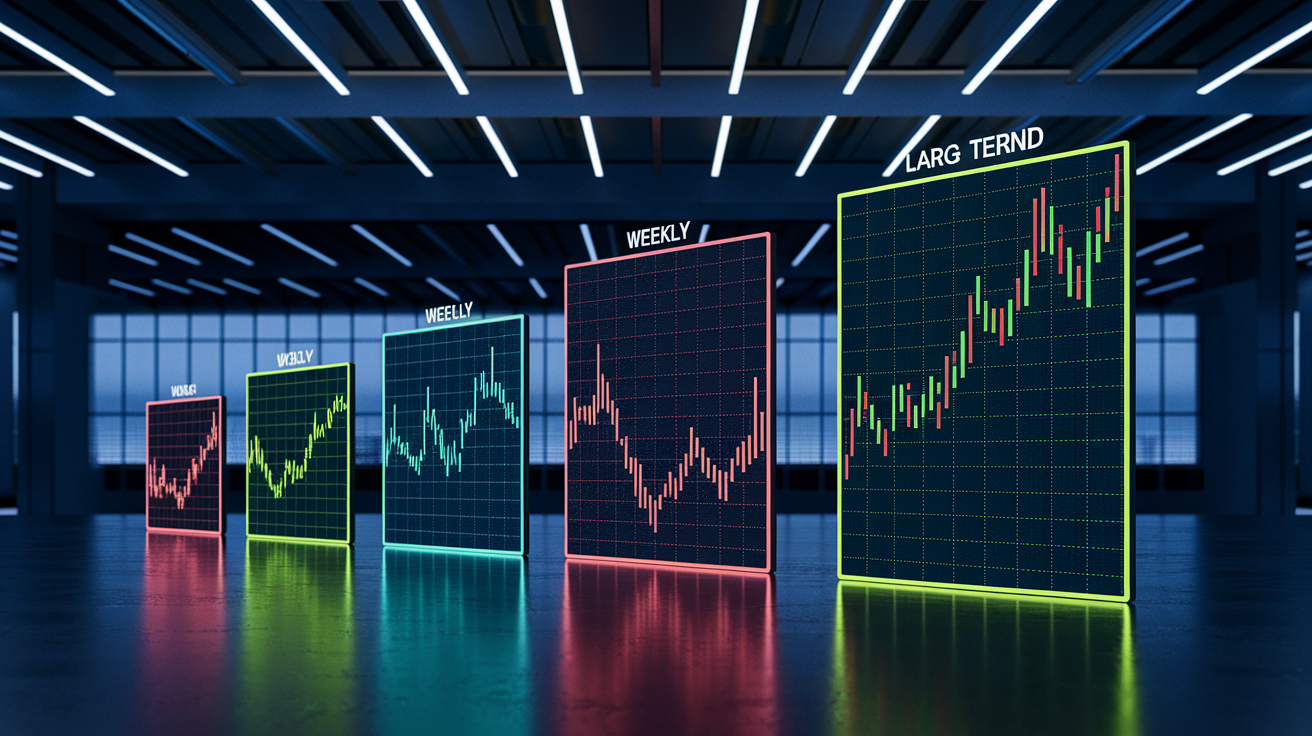
Switching the timeframe completely changes what you’re looking at. A 1-day heatmap shows you intraday volatility and immediate reactions to news. Useful if you’re day trading or just trying to understand what moved today. A 5-day (weekly) view smooths out the single-day noise and starts revealing short-term trends. If a sector’s green for five straight days, that’s early momentum building. A 1-month view captures the intermediate trend and is perfect for swing traders and tactical shifts. By the time you’re looking at 3-month or 12-month heatmaps, you’re seeing structural sector moves driven by longer-term fundamentals, not flows.
The skill is comparing at least two timeframes side by side. Tech’s dark green over 1 day but red over 1 month? Today’s rally is a bounce, not a reversal. Tech’s green across both 5-day and 3-month views? That’s confirming momentum. Both the short-term flow and the intermediate trend are lined up. When a sector moves from bottom three on a 3-month view to top three on a 5-day view, you’re watching rotation start in real time. That’s when you dig deeper: check volume, confirm with breadth, look for macro support.
Short timeframes (1-day, 5-day) whipsaw and get noisy, especially in low-volume stretches or around scheduled events like Fed announcements. Longer timeframes (3-month, 12-month) smooth volatility but lag real-time shifts. Best approach? Use a 5-day heatmap to catch emerging moves, then validate with a 1-month or 3-month view to confirm it’s not just noise. If both agree (say, both show Energy outperforming by more than +2 percentage points vs. the benchmark), that’s high conviction.
Timeframe signals to track:
- 1-day: Intraday vol, news reactions, short-term sentiment, useful for day traders but super noisy
- 5-day (weekly): Early trend signals, short-term momentum, rotation clues, best for swing traders
- 1-month: Intermediate trend confirmation, tactical allocation signal, validates 5-day moves and filters noise
- 3-month and 12-month: Structural sector strength, long-term rotation, cyclical and secular trends, guides strategic allocation
Linking Heatmap Insights to Macro and Market Forces

Sector moves don’t happen in a vacuum. They’re driven by macro forces, and the heatmap’s just a visual translation. When Financials turn green, check the 10-year Treasury yield. Banks rally when rates rise because higher rates improve their net interest margins. If the 10-year climbs from 3.0 percent to 3.5 percent and Financials go from neutral to dark green over the same stretch, that’s cause and effect. When yields fall, rate-sensitive sectors like Utilities and Real Estate often outperform because their dividend yields look more attractive and borrowing costs drop.
Energy tracks crude oil prices tight. Heatmap showing Energy in dark green? Usually coincides with rising oil. Check WTI or Brent. If oil jumps on geopolitical tension or OPEC cuts, Energy stocks follow. Materials move with industrial metals and commodity indices. Tech can be sensitive to the U.S. dollar (stronger dollar pressures multinational revenue) and long-term growth expectations. Consumer Discretionary ties to employment and consumer confidence. When jobless claims fall and retail sales rise, Discretionary tends to beat Staples. The heatmap won’t tell you why a sector’s moving, but overlaying it with macro data reveals the driver.
Earnings cycles shift heatmaps dramatically. If a sector shows persistent strength into and through earnings, that’s confirmation. Market expected good results and got them. If a sector rallies ahead of earnings but turns red after, that’s classic “sell the news.” Always cross-reference heatmap moves with the earnings calendar and analyst revisions.
Macro forces behind the colors:
- Interest rates: Rising rates favor Financials, pressure Utilities and Real Estate. Falling rates reverse the trade.
- Oil and commodity prices: Energy tracks crude, Materials track industrial metals, copper, broader commodity indices
- U.S. dollar strength: Strong dollar pressures multinationals (Tech, Industrials). Weak dollar supports exporters.
- Employment and consumer data: Strong jobs and retail sales boost Discretionary. Weak data favors Staples.
- Inflation trends: Rising inflation supports Energy, Materials. Falling inflation or deflation fears support bonds and defensives.
- Earnings cycles: Sector strength into and through earnings confirms fundamentals. Pre-earnings rally followed by post-earnings weakness signals “sell the news.”
Applying Heatmap Data to Portfolio Decisions

Once you can read the heatmap, turn that into portfolio action. Simplest rule: overweight sectors showing persistent relative strength, underweight or trim sectors showing persistent weakness. Persistent means the signal holds across at least two timeframes. For example, a sector’s green on both the 5-day and 1-month views, and its relative performance vs. the benchmark exceeds +2.0 percentage points. When that happens, consider adding exposure. Size the position based on conviction and risk budget: small tactical tilt might be 2 to 4 percent of your portfolio, medium allocation 5 to 10 percent, aggressive trade 10 to 20 percent for high-conviction setups.
Use the heatmap to guide rebalancing. If a sector you own has shifted from dark green to red over multiple timeframes, and the move’s confirmed by falling volume and negative earnings revisions, that’s a signal to trim or exit. Conversely, if a lagging sector turns green with rising volume and supportive macro, it’s a candidate to add. Rebalance on a regular cadence (weekly scans for tactical traders, monthly reviews for longer-term allocators) and document your rationale: date, timeframe, sector percent change, benchmark change, relative performance, position size, stop loss level.
Heatmaps also improve diversification. If your heatmap shows 80 percent of your portfolio concentrated in two bright green sectors, you’re taking single-theme risk. If those two sectors turn red together, your portfolio gets hammered. A well-diversified portfolio should have exposure across multiple sectors, even if some are neutral or slightly negative, to hedge against sudden rotations. Use the heatmap to spot over-concentration: if your top two sectors account for more than 50 percent of gains over the past month and both are in the same macro bucket (like cyclicals), consider hedging or adding defensive exposure. A balanced view (no single sector accounting for more than 25 to 30 percent of your portfolio unless it’s a strategic mandate) reduces downside when rotations happen fast.
Practical uses:
- Tactical overweighting: Add 3 to 6 percent exposure to sectors showing relative performance >+2.0pp with persistence and volume confirmation
- Underweighting laggards: Trim or exit sectors with relative <-2.0pp over multiple timeframes, especially if volume’s declining
- Rebalancing triggers: Review heatmap weekly or monthly. Rebalance when relative crosses ±2.0pp thresholds with 3-day or weekly persistence.
- Diversification checks: Limit single-sector exposure to <25 to 30 percent of portfolio. Flag over-concentration when top 2 sectors drive >50 percent of gains.
- Hedging decisions: When sector breadth narrows (top 2 sectors = >50 percent of index gains), add index put protection or reduce concentrated exposure
Preventing Misinterpretation and Common Analytical Errors

Even experienced people screw up reading heatmaps. Most common mistake? Overreacting to single-day color changes without checking persistence or volume. A sector can turn bright green for one day because of a single stock’s earnings beat or short squeeze, then fade back to neutral the next day. Always require at least two to three consecutive days of the same color, or confirmation across a longer timeframe, before acting. One-day moves are noise unless backed by a clear catalyst and follow-through.
Another mistake is ignoring tile size and sector weighting. A small sector flashing dark green might look exciting, but if it’s only 2 percent of the index, its impact on your portfolio or the broader market is minimal. Focus on large tiles first (Technology, Financials, Healthcare) because moves in these sectors drive the index and affect correlated assets. A 3 percent gain in a 30 percent weighted sector matters way more than a 5 percent gain in a 2 percent weighted sector. Also, don’t assume all bright greens are bullish or all reds are bearish without macro context. A sector can rally for the wrong reasons (short-covering squeeze) or fall due to profit-taking after a strong run, not deteriorating fundamentals.
Heatmaps show performance, not valuation or quality. A sector can be bright green because it’s genuinely strong, or because it was deeply oversold and is bouncing. Always pair heatmap signals with fundamental checks: earnings revisions, price-to-earnings ratios, balance sheet quality. If a sector’s green but trading at historically high valuations with negative earnings revisions, the heatmap might be signaling the end of a rally, not the start.
Mistakes to dodge:
- Reacting to single-day moves: Don’t trade on one bright color. Require 2 to 3 days of persistence or multi-timeframe confirmation.
- Ignoring sector weight: Small sectors (2 to 5% index weight) have limited portfolio impact even with large percentage moves.
- Misreading block size: Larger tiles = more index influence. Prioritize moves in high-weight sectors like Tech, Financials, Healthcare.
- Neglecting macro context: A green sector might be rallying for technical reasons (short squeeze, oversold bounce) rather than fundamentals.
- Skipping valuation checks: Bright green sectors can be overvalued and nearing reversal. Pair heatmap with P/E, earnings revisions, quality metrics.
When to Seek Additional Market Analysis Tools
Heatmaps are powerful, but they don’t tell the whole story. They show you what happened and where the market moved, but not why or whether it’ll last. When you see a sector showing strong performance, next step is digging into fundamentals: check earnings reports, revenue growth, margin trends, analyst estimates. If Energy’s dark green but oil inventories are rising and demand forecasts are falling, the rally might be short-lived. If Energy’s green and earnings revisions are turning positive with supply constraints tightening, the heatmap’s confirming a fundamental shift.
Technical indicators add another layer. Use moving averages, RSI, and MACD to confirm whether the heatmap signal aligns with price momentum and trend direction. For example, if a sector’s green on the heatmap but trading below its 50-day moving average with RSI above 70, it might be overbought and due for a pullback. If the sector’s green, trading above key moving averages, and RSI’s in the 50 to 60 range, that’s a healthier setup for continued strength. Volume analysis is critical. Rising price on rising volume confirms conviction. Rising price on falling volume suggests weak follow-through.
Economic reports and macro data provide the “why” behind heatmap moves. Pair heatmap scans with releases like non-farm payrolls, CPI, GDP, Fed minutes, PMI data. If the heatmap shows cyclicals rallying the day after strong jobs data, you’ve connected cause and effect. If it shows defensives rallying despite strong data, that’s a divergence worth investigating (maybe the market’s pricing in a policy mistake or slowdown ahead). Always layer heatmap insights with at least one or two additional tools before making allocation decisions.
Tools to add:
- Fundamental analysis: Earnings reports, revenue growth, P/E ratios, earnings revisions, balance sheet quality
- Technical indicators: Moving averages (50-day, 200-day), RSI, MACD, volume trends, support/resistance levels
- Economic data releases: Jobs reports, CPI/PPI inflation data, GDP, retail sales, PMI surveys, Fed policy minutes
- Breadth indicators: Advance-decline lines, new highs/lows, sector participation rates to confirm or question heatmap signals
Final Words
Spot the strongest and weakest sectors at a glance — that’s the action this guide put you in. You learned what heatmaps show, which metrics drive color and size, how to spot patterns and timeframe signals, and how macro forces link to sector moves.
We also covered practical portfolio steps, common misreads to avoid, and when to lean on extra tools like earnings or technicals.
Keep practicing; interpreting sector performance heatmaps will make your allocation calls clearer and more confident.
FAQ
Q: What is a sector performance heatmap?
A: A sector performance heatmap is a visual tool that shows how market sectors performed, using colors (green for gains, red for losses), with color intensity and block size indicating move magnitude and weight.
Q: Why should investors use sector heatmaps?
A: Investors should use sector heatmaps to quickly identify leadership, laggards, and rotation, turning many tickers into a single glanceable view for allocation decisions and idea generation.
Q: How do color and intensity work in heatmaps?
A: Color and intensity in heatmaps indicate direction and magnitude: green for up, red for down, and stronger saturation or darker shades mean larger percent moves or relative strength.
Q: What metrics drive heatmap visuals?
A: Heatmap visuals are driven by metrics like percent return, volume change, market-cap weighting, relative strength, and intraday price moves; block size often reflects sector or stock weight.
Q: How can I spot trends and rotations on a heatmap?
A: You spot trends and rotations by finding clusters of similar colors across related sectors, watching persistent color shifts over multiple periods, and noting leadership moves between cyclical and defensive groups.
Q: How should I interpret heatmaps across different timeframes?
A: You should interpret heatmaps by timeframe: intraday shows volatility, daily/weekly shows short-term trends, and monthly/yearly reveals structural strength or weakness to avoid overreacting to noise.
Q: How do macro factors show up on heatmaps?
A: Macro factors show up as sector-wide moves—like rising rates pressuring utilities/REITs or inflation lifting energy/materials—so correlated sector clusters often point to macro drivers.
Q: How can I use heatmap insights for portfolio allocation?
A: You can use heatmap insights to overweight strong sectors, reduce exposure to laggards, rebalance on rotation signals, confirm diversification, and create watchlists for emerging opportunities.
Q: What common mistakes should I avoid when reading heatmaps?
A: You should avoid overreacting to short-term color flips, ignoring block size (weighting), treating saturation as the only signal, and neglecting macro or earnings context.
Q: When should I use other analysis tools alongside heatmaps?
A: You should use other tools when you need confirmation: pair heatmaps with fundamentals, earnings calendars, technical indicators, and macro data to validate signals and reduce false positives.